“Imperfection is beauty, madness is genius and it’s better to be absolutely ridiculous than absolutely boring.” ― Marilyn Monroe
What the heck brought that on?
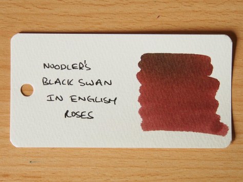
The second in this batch of ink reviews, for Noodler’s Black Swan in English Roses, that’s what!
I will defer to Mr Tardiff again for the story behind this ink (which bears more significance than normal this year):
This 3 oz bottle came from my preferred Ebay supplier and so I would consider it moderately priced. The bottle and box are the usual fare. The test pen on this occasion was a Pilot MR White Tiger with a Medium nib – a nice match it was too.
There was partial water resistance. Cleaning was easy enough, but with the same sooty deposits as Black Swan in Australian Roses. Drying time was on the long side at 1 minute – this really does seem to be a feature of deeply saturated reds.
As this is another shading ink, I tried the snappily titled “cotton bud on a Ryman Memo Block sheet” test again, to great effect. Not only did it show up the full range of colours this ink is capable of, but also revealed a greenish gold metallic sheen in some areas. Very nice too.
I like it so much you get to look at it twice.
Rhodia Dot Pad No 16

On this paper it’s a rather nice, if a little understated, brownish red, with a hint of burgundy. A very nice notetaker, and the shading shows. I checked the smell again, and its still fruity but the vinegar hint has gone.
Ryman Memo Block 9cm x 9cm

Nice shading again, a good experience.
Yellow Post-It

Good again, with a nice contrast, despite a little skipping.
Field Notes – Pitch Black

Some feathering, but little bleed through and spreading. A good experience. I was expecting the colour to mute a little, but it didn’t.
I originally messed this review sample up – I mislabeled it and it appeared on the wrong review first time around. When amending the sample for rescanning I used a pen with a different nib – resulting in more feathering and more bleed through, showing how sensitive this ink is to the pen used.
Mnemosyne Word Card

Truly bizarre – this looks like a different ink – and not a very nice one either. More brown than red, like a washed out terracotta. If I had seen this before buying the ink I probably wouldn’t have bothered.
An updated image of the Word Card is here:

Conclusion
I have tried this ink with other pens (including flex), and the results can be as variable as with different papers.
I wish this ink was waterproof, and quicker drying, but I will embrace those imperfections with good grace. In fact, I would go so far as to say that if this ink had to be reformulated to change it’s colour and behaviour it would be a tragedy. I’m more than happy to live with its foibles, and it has become easily one of my favourite inks.
[flickr_tags user_id=”49365066@N07″ tags=”noodlersblackswaninenglishroses”]


I really love the color of this ink! Did the ink turn the terracotta color over time or when it dried? I have tried ink samples of this ink with white tiger pen as well.
Thanks for visiting. In my experience the ink tends to be slightly more reddish when first put down on the paper, then becomes more muted as it dries. It will also depend on the flow of the pen and the absorbancy of the paper.